


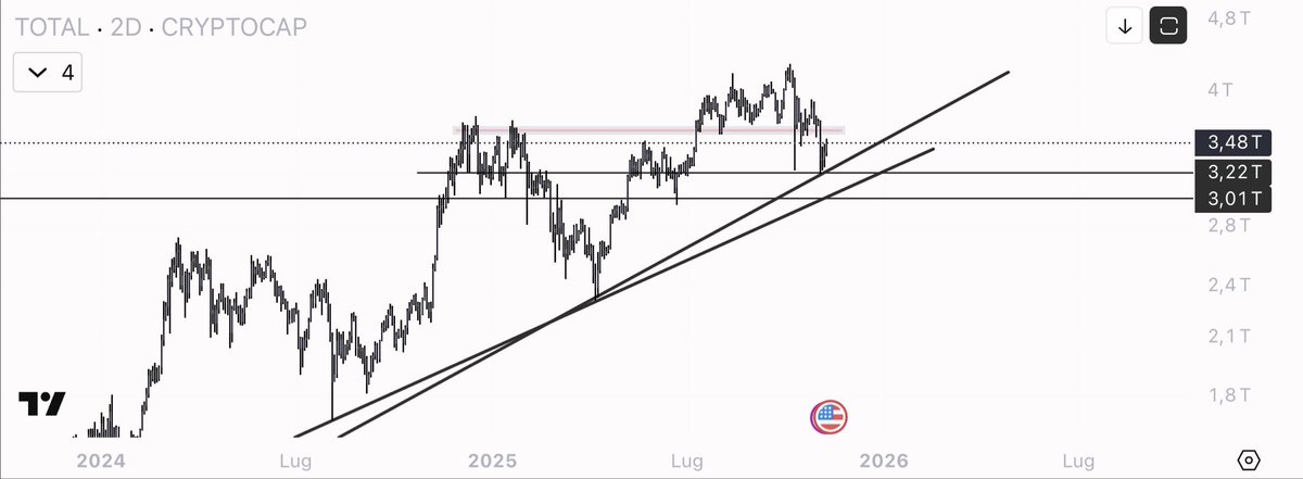
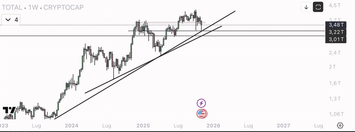
I wanted to give you a general idea of the market. $TOTAL
The red box up there is the barrier holding back the market: it is not just a line, it is an area where supply has repeatedly prevailed. As long as we remain below it, the rises may be violent but they tend to fizzle out: we need acceptance and clean closes above that area to talk about a real continuation of the cycle, not just simple rebounds.
Below, the confluence of the two trend lines is the point that really matters. It is a 'structural' support: that is where the memory of the trend lies and where the market has defended its directionality several times. As long as it holds, the narrative remains constructive👉🏻perhaps messy, perhaps slow, but with a still positive bias. If we lose it, however, we can expect those unpleasant phases: compressed volatility, messy candles, red days alternating with rebounds without follow-through. In a word: choppy.
Operationally, it's simple for me: above the red box with volume and higher-timeframe closes, it makes sense to look for 'tomo'. At the confluence of the trendlines, on the other hand, I look for signs of absorption and reclaim to work rebounds with defined risk. If the level jumps, no ego: I wait for the market to rebuild a base lower down.
is better to be guided by the chart than by expectations.
From X
Disclaimer: The above content reflects only the author's opinion and does not represent any stance of CoinNX, nor does it constitute any investment advice related to CoinNX.