


THIS is something you need to watch closely.
💀 The S&P 500 just printed a “DEATH CROSS” on the daily chart.
What does it mean — and what does history tell us? 👇
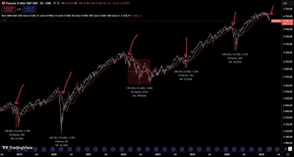
👉 The 50-day simple moving average has crossed BELOW the 100-day simple moving average.
👉 Since 2018, this has only happened 5 times — and EVERY single time, further downside followed.
🩸 2018 = -16% in 43 days
🩸 2020 = -14% in 6 days
🩸 2022 = -21% in 237 days
🩸 2023 = -7% in 14 days
🩸 2025 = -12% in 26 days
March 2026 = …?
📍 Based on this TECHNICAL signal, the S&P 500 could still have more downside ahead.
Do you think history repeats? 👀
From X
Disclaimer: The above content reflects only the author's opinion and does not represent any stance of CoinNX, nor does it constitute any investment advice related to CoinNX.